Tuesday, 28 February 2017

Introduction to Focus Group

Now that the early stages of my magazine are in development, this weekend I formed a focus group to give their opinion throughout the project and guide me in the direction that will be most preferred by my target audience, as the four members of my focus group all fit the target audience of my magazine by having a preference for light indie/mainstream music and being in my target age of 16-24

To achieve a balance, in my focus group I have two males and two females.


Age: 18
Favourite artist: Adele
Favourite song: Hello
Favourite genre: Mainstream/Light Indie


 Age: 17
 Favourite artist: Fifth Harmony
 Favourite song: Work from Home
 Favourite genre: Mainstream


Age: 16
Favourite artist: Bruno Mars
Favourite song: Uptown Funk
Favourite genre: Light Indie


Age: 19
Favourite artist: The Chainsmokers
Favourite song: Closer
Favourite genre: Mainstream


Monday, 27 February 2017

Weekly Plan

This week is work experience week, so I do not have access to the software. Instead, I intend to carry out some audience research this week. I also plan to create a focus group.

Sunday, 26 February 2017

Week in Review

This week, I have completed my research into similar media products. I have also completed the article for my double page spread, and I have also chosen the fonts I will be using in my rough cut, so I am slightly ahead of schedule which leaves me more time in the next two weeks to work on my routhncut.

Friday, 24 February 2017

Barcode

Today, I created a barcode for my front cover using photoshop, simply by using the rectangle tools and randomising them and stretching them out. My result can be seen below.

Thursday, 23 February 2017

New Fonts Chosen

Today I chose the two main fonts I intend to use throughout my magazine. I got these fonts from dafont.com.

Bebas Neue is a modern, thin, sans-serif font that I intend to use for article titles and headlines. I have chosen it because of its simplicity and timeless look.


Lemon/Milk was chosen as it has slightly more 'personality' than Bebas Neue, and shall be used for smaller things such as featured articles and embedded quotes within articles.

Wednesday, 22 February 2017

3) Analysis of an Existing Contents Page

Image result for music magazine contents page
Colour: This magazine follows a highly basic colour scheme, with black, white and red being the only colours on the page. This simplistic effect is something very typical in this genre.
I intend to include simplicity in my design in order to not alienate weaker readers, so my contents page will be blocky but will also feature lots of images rather than significant amounts of text.

Image: The images used are relatively simplistic; one is a midshot and one is a long shot, plus a photo of an album. The retro, old fashioned look/quality of the photos is one frequently found in this genre.
However, this is not a technique I intend to use; instead I am aiming for a more modern vibe in order to attract a slightly more generalised audience than this magazine is.

Font: Again, the titlular font and article headlines tend to be writtenin a relatively modern sans-serif font, but the article descriptions are in serif as is typical in music magazines.However, this magazine breaks convention slightly by having the featured articles on the right written in serif font, whereas in almost all similar media products I have researched, this has been written in sans-serif instead.
Again, I intend to follow the traditional conventional approach to fonts; modern, sans-serif font for titles and headlines,with traditional serif font for larger bodies of text.

Layout: The contents page uses a blocky layout, with photos down the side and purely text on the right. It is a very traditional look used which matches the retro look of this magazine.
In my magazine, I plan to use an image dominated look (although this may change) to be consistent with the modern themes running throughout my design.

Tuesday, 21 February 2017

3) Analysis of an Existing Front Cover

Colour: This front cover uses a very light, bright and vivid colour scheme in a bid to make the magazine appeal to it's target audience of the younger generations. Furthermore, the models are dressed in co-ordinating colours, with green, blue and black outfits matching the colour scheme of the page, which ensures they don't look out of place or awkwardly fit in.
This magazine is a very similar style to mine; even the colour scheme is largely similar, with blue, white and black being the prevailing colours. I potentially intend to use the red tickets over certain parts of text in my magazine as I think it is highly effective at making the key details stand out.

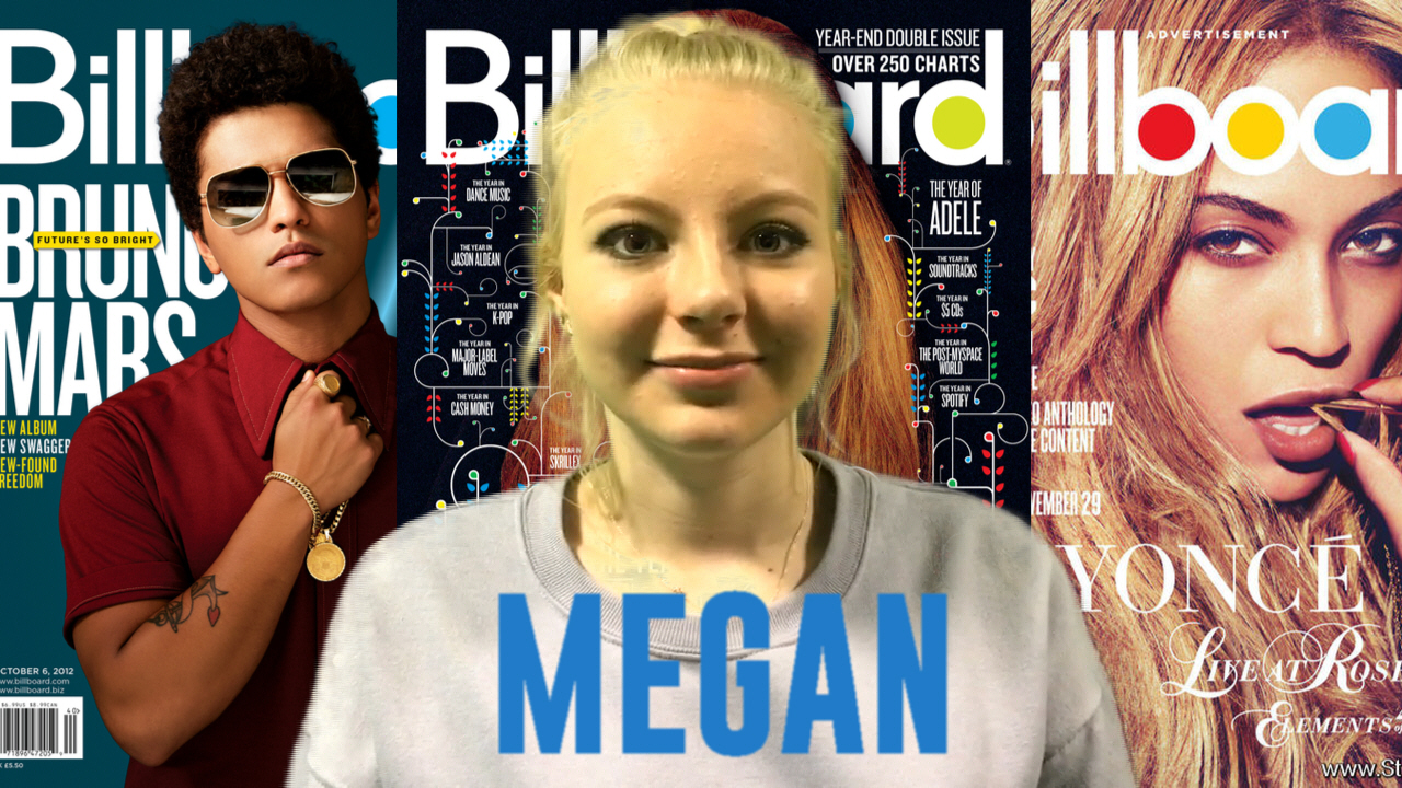
Image: The image used is a mid-two shot, which appears to be one of the most common shots used in this type of magazine. Both models are given relatively equal space on the page, suggesting neither is overshadowing the other in terms of success and power.
On my front cover, I intend to use a close up shot of a girl in order to appeal to my target audience; teenage/young adult women will idolise her, whilst teenage/young adult men may find her attractive, both of which will potentially compel the target audience to buy the magazine. 

Font: The front cover uses exclusively modern, thin sans-serif font (a technique I also intend to use) This ensures younger readers are not put off by old-fashioned text as it may deter them from wanting to read on, as they may anticipate large blocks of serif text that does not suit their wishes.
I am planning to use a similar scheme; no serif font on the front cover to avoid alienating younger readers, but I will use serif font later on in its traditional places. 

Layout: The layout is highly conventional, with the models in the middle and the text around the side, with the logo prominently displayed at the top of the page.
I will not be using this technique- instead my main headline will be written across the page in the bottom third, with feature articles scattered around the side. However, my magazine title will retain the conventional centre-top stature, and I also intend to follow the convention of having the model's head overlap the title (as shown above)