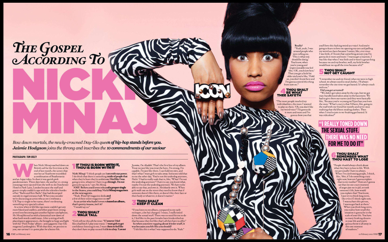
Colour: The magazine uses a very feminine colour palette, with different shades of pink dominating the page because of the background, suggesting it is predominantly aimed at girls due to the stereotypical association of pink with females. The text uses a regular black, which also matches the photo of Nicki Minaj. This is effective as the black stands out from the pink and gives the impression that Nicki 'stands out' from everything else.
In my magazine, I intend to follow an aquatic colour scheme, with whites, blues and blacks dominating the pages. I am not yet sure what colours I will use for my model, but currently I am considering using colours that stand out from the background in a similar manner to the above double-page spread.
Image: The image used is very simple and minimalistic: Nicki is placed very prominently on the right half of the page. Additionally, the rule of thirds is used to make certain features of the model stand out. Particular attention is drawn to her eyes and her breasts.
In my magazine, I will try to employ the rule of thirds, particularly on my double page spread, in order to direct the reader to the most important parts of the photo.
Font: The article uses a small variety of fonts- the headline uses a modern, sans-serif font to grab the reader's attention and serves as a stark contrast to the remainder of the article, which uses more traditional serif fonts. At points throughout the article, important quotes are shown in sans-serif, bold font, which helps to distinguish the most important parts of the text from the rest of it.
In my magazine, I intend to use mostly sans-serif, modern fonts for my titles, headlines etc, but I also aim to use traditional serif fonts in my articles in order to follow the conventions of a music magazine.
Layout: The double-page spread is set our in a somewhat unconventional way, with the model being mostly positioned on the right page with the vast majority of the text on the left. Typically in music magazines, this is the other way round, suggesting the magazine is aimed at an audience that responds well to change and experimentation.
My magazine is aimed at a light-indie/modern audience, who tend to be receptive to change and experimentation, so I am keen to include this in my magazine. However, I intend to carry out some audience research on this before I reach any solid conclusions.
Content: The article itself is written in a fairly informal manner, clearly with the intention of appearing relatable, reliable and trustworthy to their target audience. After the introduction, the article is split into three distinct points/sections from an interview with Nicki Minaj, allowing the reader to easily follow the key points Nicki is making in the interview without excess baggage that may bore the reader.
I am not yet sure what the subject of my double page spread will be, but currently I am considering a Q&A session with the model.

No comments:
Post a Comment