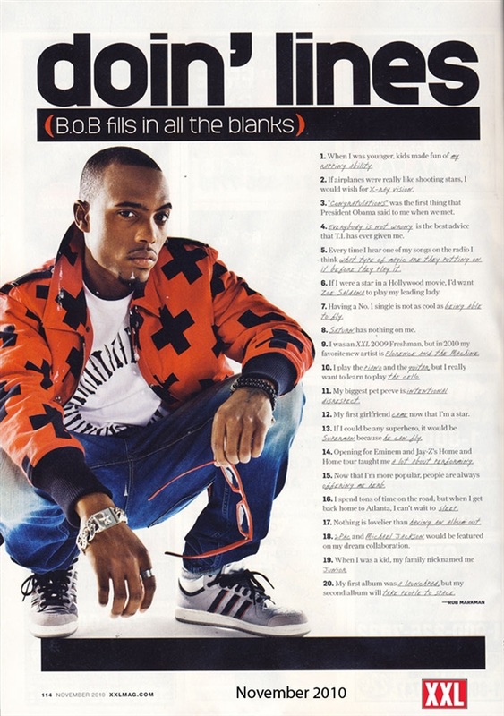
Colour: The colour scheme used here is very basic- sticking to a mainly black and white colour scheme, with the exception of the model who is dressed in brightly coloured clothes in order to stand out from the background- a trait I have noticed is used very frequently in music magazines.
On my contents page, I intend to follow a different approach, as I plan to create an image-dominated contents page. However, I will take extra care to make sure it matches the aquatic colour scheme running throughout my magazine.
On my contents page, I intend to follow a different approach, as I plan to create an image-dominated contents page. However, I will take extra care to make sure it matches the aquatic colour scheme running throughout my magazine.
Image: The long shot used in the photo shows the entire body but because he is kneeling down it creates a more personalised link between the reader and the model. His body language suggests he is open minded and not afraid to connect with the reader.
In my magazine, I actually intend to use a very similar tactic. In fact, one of my potential images for my double page spread has a very similar positioning (as shown).
In my magazine, I actually intend to use a very similar tactic. In fact, one of my potential images for my double page spread has a very similar positioning (as shown).
Font: The font used varies- for the main headlines, sans-serif font is used, but for any larger bodies of text, serif font tends to be used.
This is a technique I plan to deploy within my own magazine as it strikes an essential balance between the two types of font.
This is a technique I plan to deploy within my own magazine as it strikes an essential balance between the two types of font.
Layout: The contents page is a hybrid between image dominated and blocky style, as it incorporates elements of both.
In my magazine, I will not create a hybrid- instead, I intend to create a purely image-dominated contents page.
In my magazine, I will not create a hybrid- instead, I intend to create a purely image-dominated contents page.

No comments:
Post a Comment