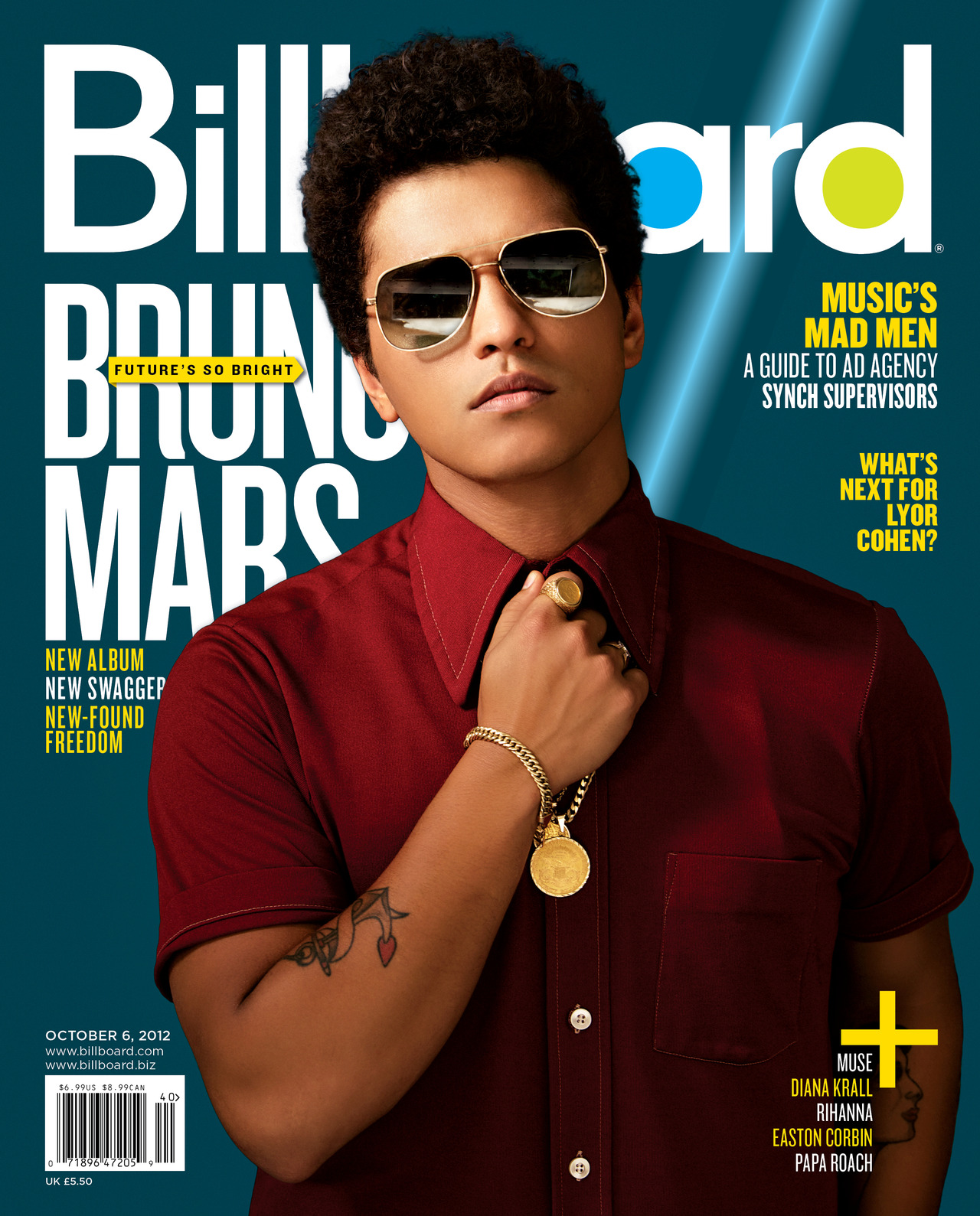
Colour: The magazine uses a very simplistic colour scheme, sticking to the trio of blue, yellow and white. The one exception to this is the model, Bruno Mars, who is dressed in maroon, serving as a stark contrast to the background of the cover and clearly highlighting him as an item of prominence.
In my magazine, I plan to use an aquatic colour scheme, in a similar manner to the one above, but rather than yellow i intend to use black, although this colour scheme is not confirmed yet.
In my magazine, I plan to use an aquatic colour scheme, in a similar manner to the one above, but rather than yellow i intend to use black, although this colour scheme is not confirmed yet.
Image: The midshot image of Bruno Mars is central to the page and overlaps the magazine title, which is a typical convention of a music magazine. Additionally, it uses the rule of thirds, with Bruno's head being in the middle third in order to signify his importance.
In my magazine, I intend to overlap my title with the image in a similar manner to the magazine above, as it is a highly typical convention of a music magazine that I feel inclined to follow. Furthermore, I will use a close up image, rather than a midshot, in order to create a sense of intimacy and personalisation.
In my magazine, I intend to overlap my title with the image in a similar manner to the magazine above, as it is a highly typical convention of a music magazine that I feel inclined to follow. Furthermore, I will use a close up image, rather than a midshot, in order to create a sense of intimacy and personalisation.
Font: Throughout the cover, the font used tends to be a highly modern, sans-serif font, with no visible serif, suggesting the magazine is aimed at a young, modern audience who will be more attracted to a simplistic design than a more elegant serif font would give.
In my magazine, I intend to use primarily sans-serif font as I intend to reach a similar audience to the magazine above. However, I will still use serif font for some small pieces of text and articles within the magazine so that the reader is not alienated by the lack of traditional text.
Layout: The image is central to the page, with the headline and other featured articles being positioned around the outside of the page, rather than overlapping him. Additionally, the title is at the top of the page in order to distinguish it from the rest of the text on the page, and helps the reader instantly identify the magazine.
In my magazine, I will not use be positioning my headlines and featured articles around the image- instead, they will overlap. This is due to the nature of a close up shot, which takes up the vast majority of the page, meaning it would be highly impractical to fit importnt text in this small area.
In my magazine, I will not use be positioning my headlines and featured articles around the image- instead, they will overlap. This is due to the nature of a close up shot, which takes up the vast majority of the page, meaning it would be highly impractical to fit importnt text in this small area.
No comments:
Post a Comment